Long Center Brand Development
2024
Realign the Long Center brand to reflect a vibrant, community-based mission focus with an expressive, contemporary look.
Project Duties:
Art Direction & Design
Collateral Execution (digital + print)
Email and Website Design
Vendor Management
Copywriting
Vision
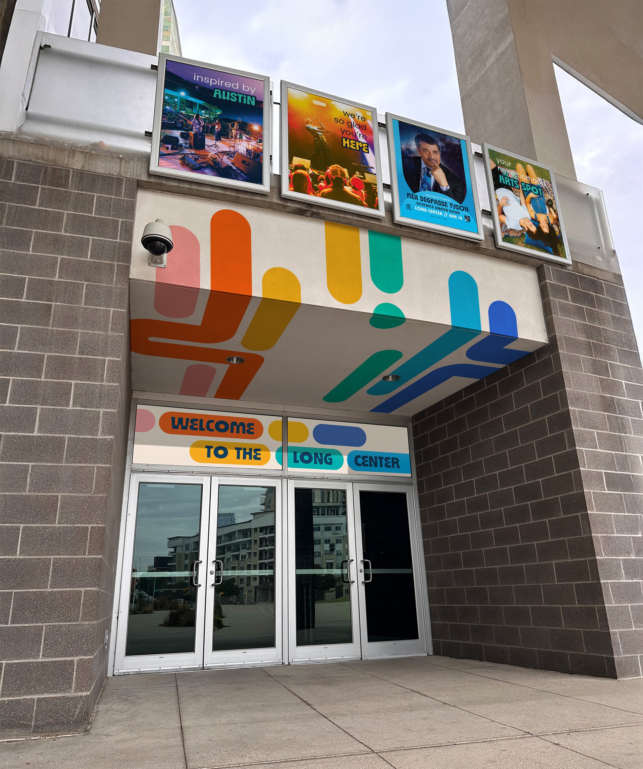
Relevant & Reflective
It’s central location lands the Long Center literally at the center of the community with a growing younger audience. The brand needed to shed its dated, traditional performing arts look for something modern and playful yet still somehow nostalgic.
Challenges
Creative Agility is Key
With a wide variety of ever-shifting programming, the brand required intense flexibility to speak to equally diverse audiences and use cases. Creating a brand that could be playful and cheeky but still able to serious and buttoned up where required. Another requirement was no major change to the logo was to be made.
Outcome
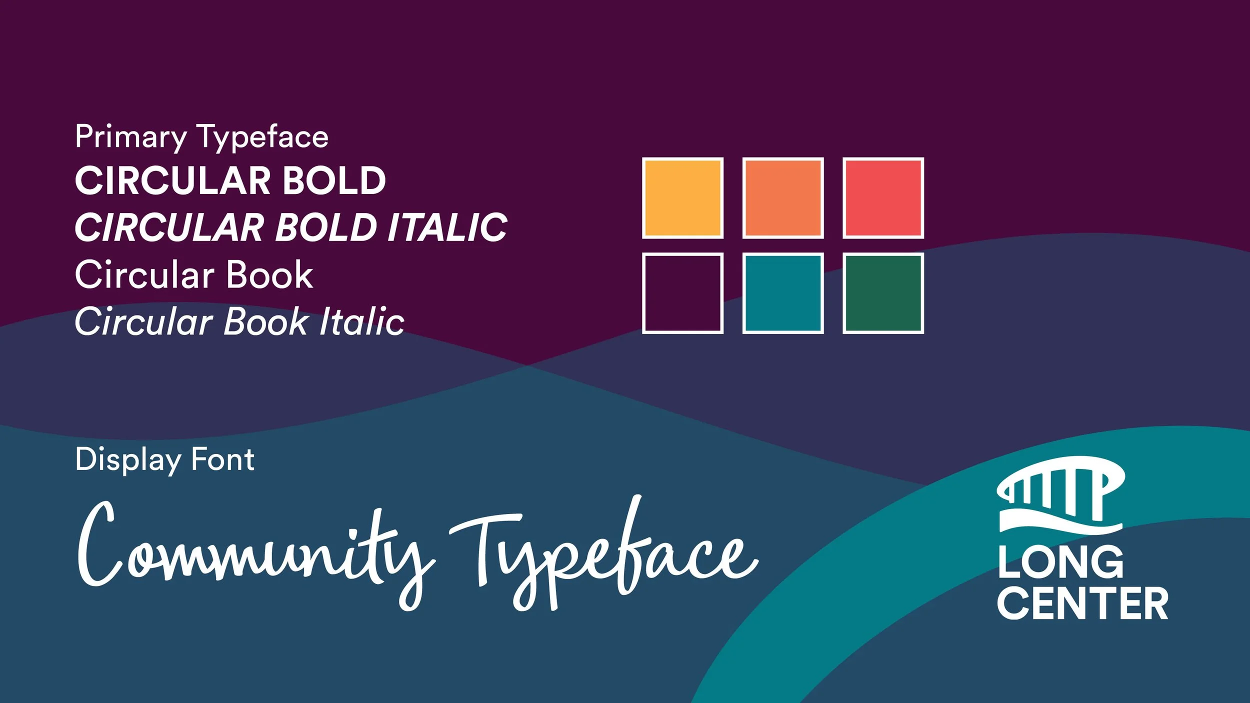
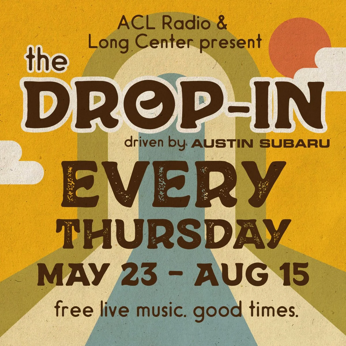
Modern, Bold, yet Retro
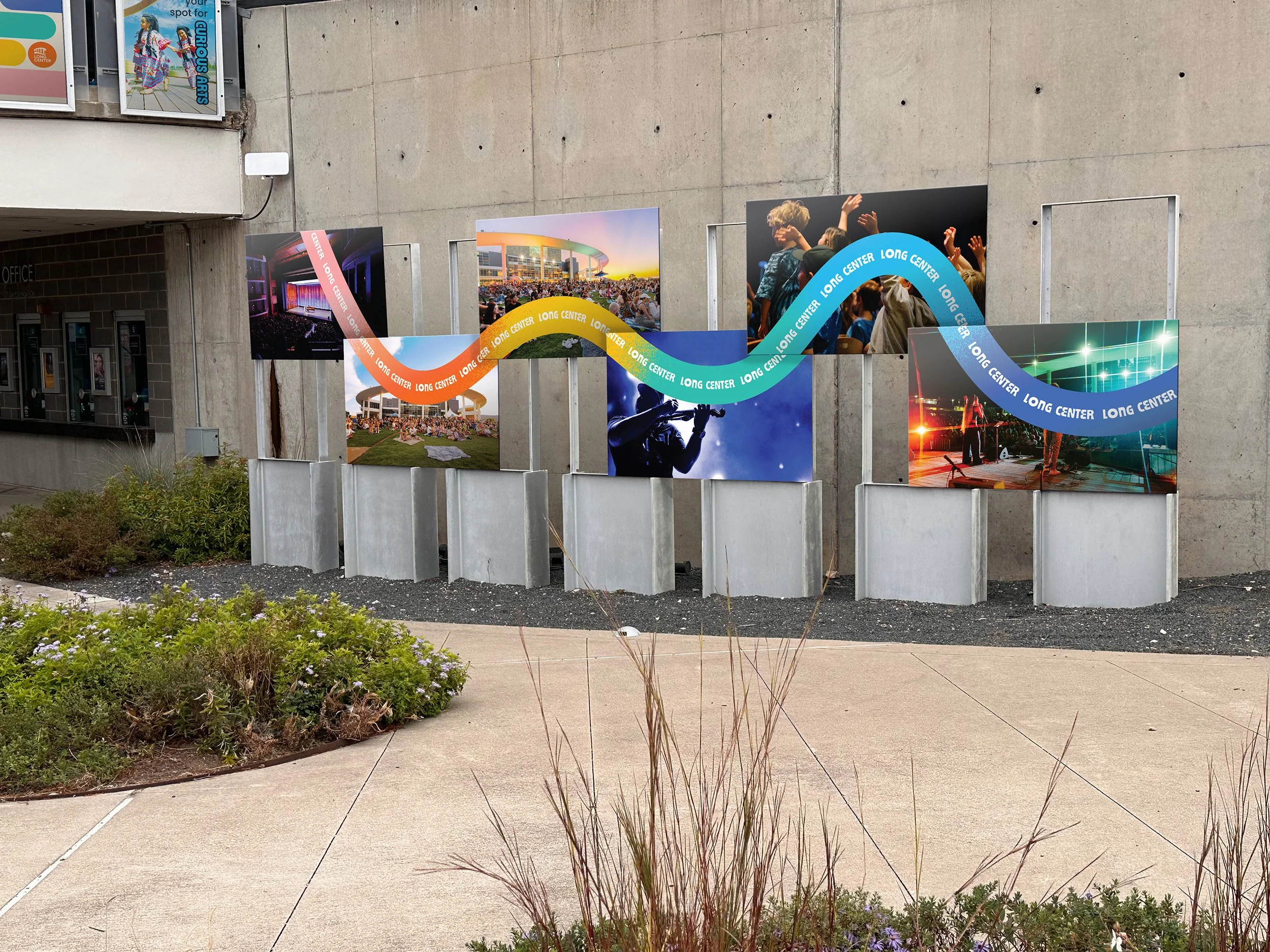
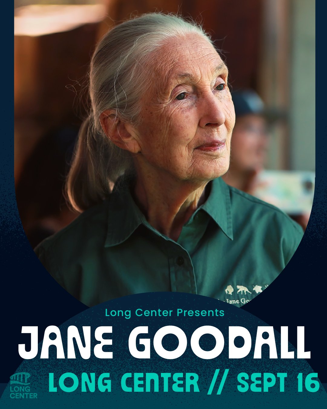
A clear flexible design system with a ranged, but modern, palette paired with a funky, retro font. Rather than a strict guidelines, something that allows for creative expression and playfulness within the brand
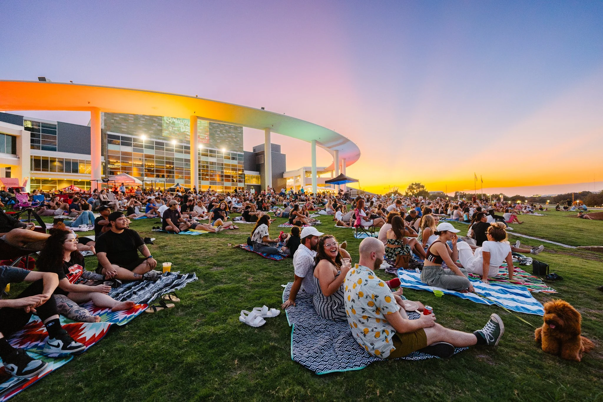
Header photo: Brynn Osborn
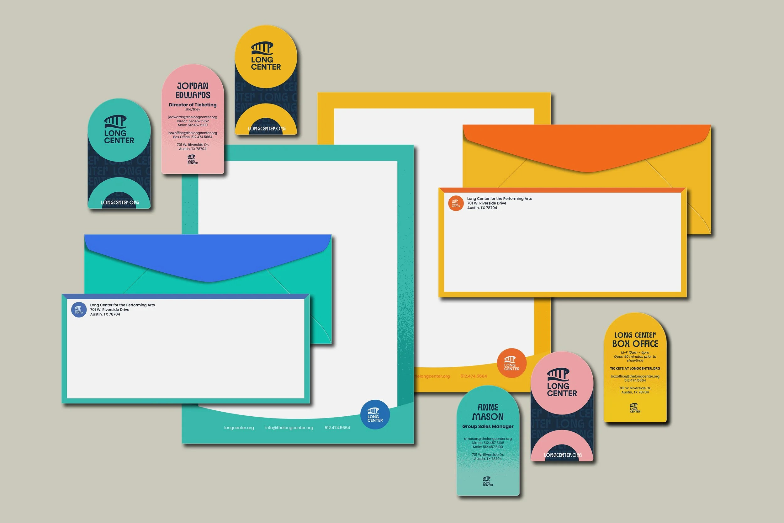
Identity
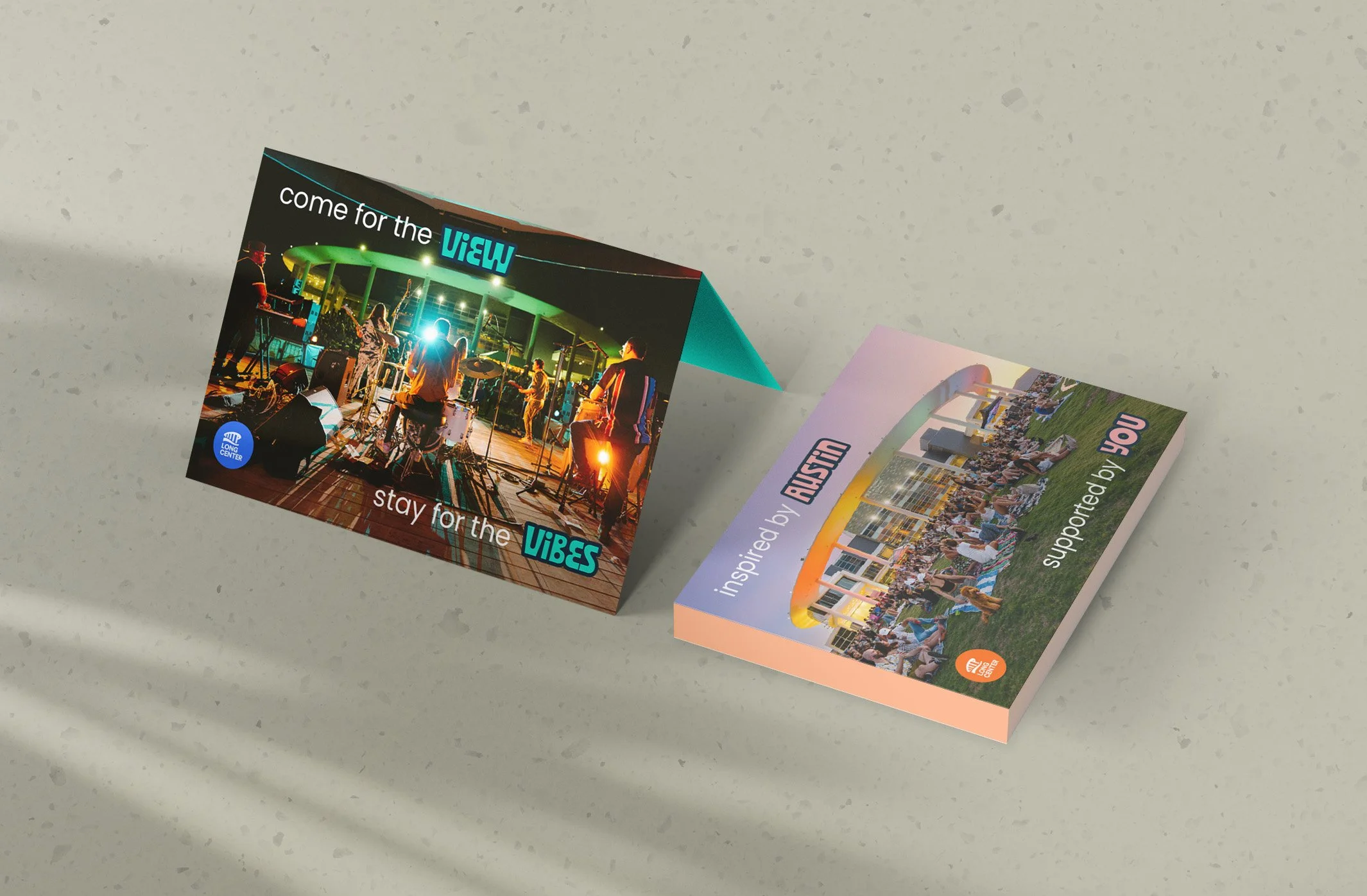
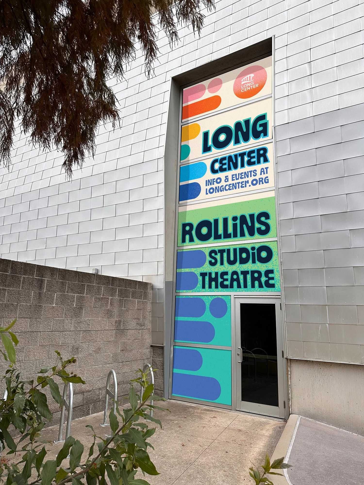
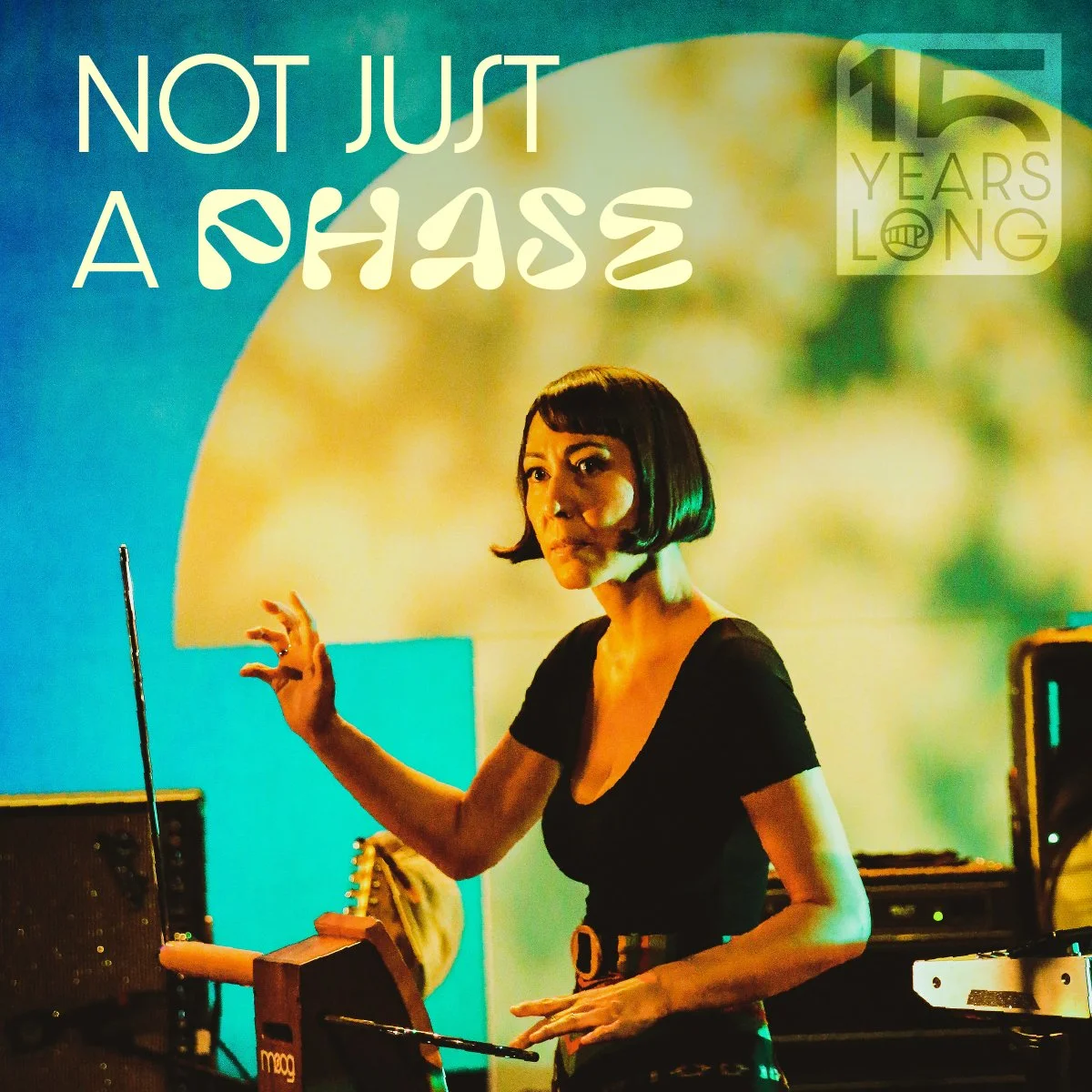
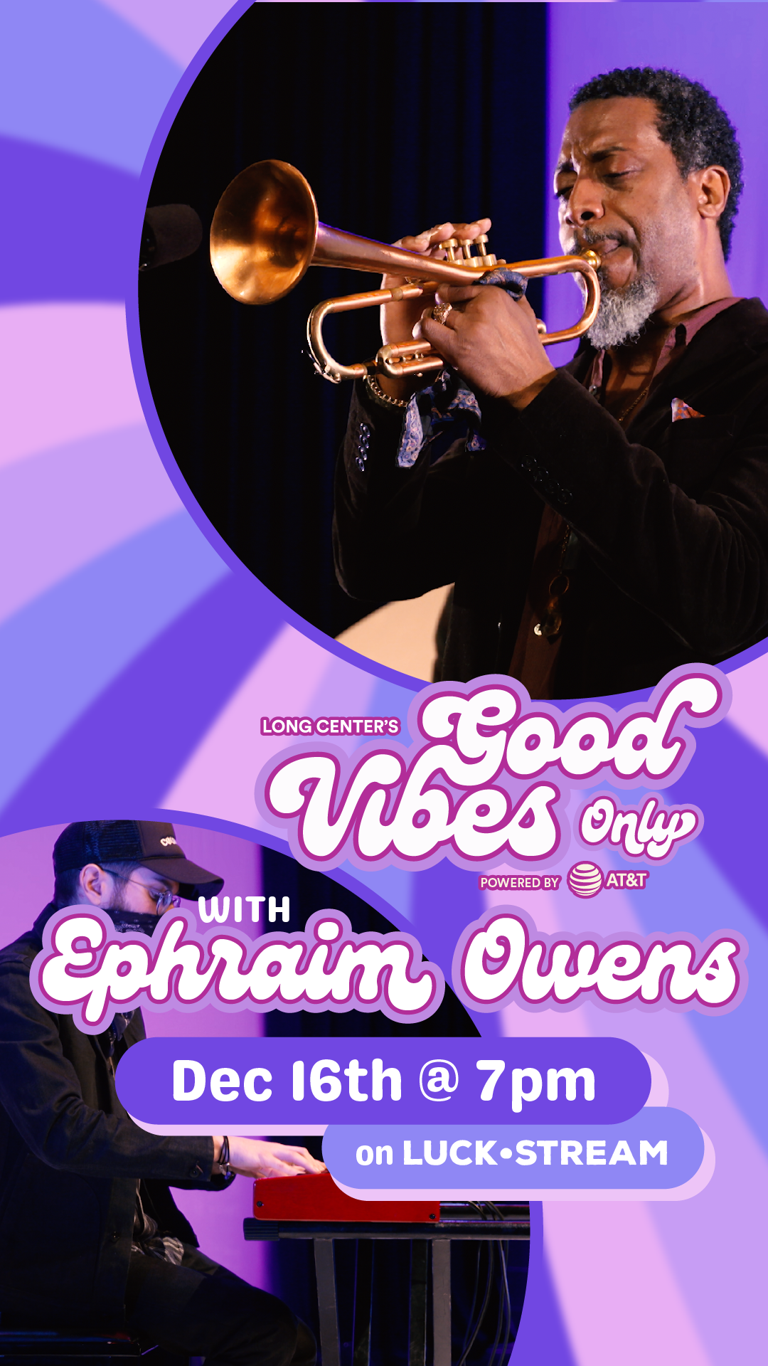
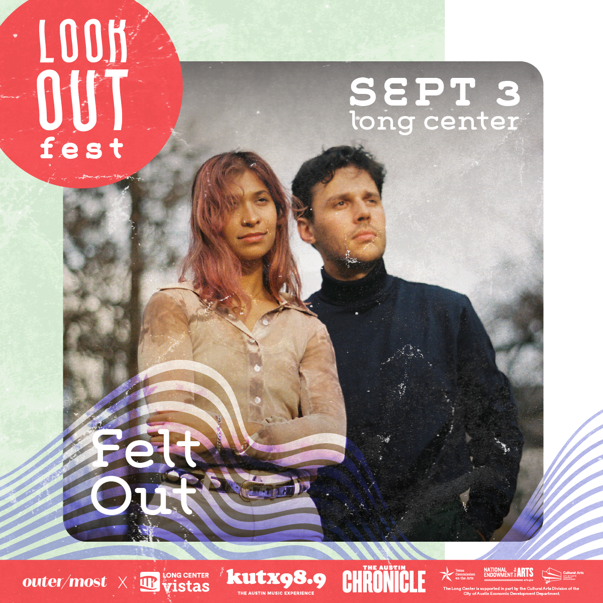
Collateral
Long Center Brand: 2016-2019
An inaccurate description of the audience, this branding was painfully traditional and drab. The muted rainbow colors were lifeless, dull, and difficult to use in practical applications. The display font, built from handwriting samples of Long Center patrons, while unique, was ultimately dated visually.
Development
Mismatched Identity
As the brand was not functioning as intended, it was avoided altogether. Campaigns and owned events became exploration sessions into what we really wanted from and for the Long Center brand.
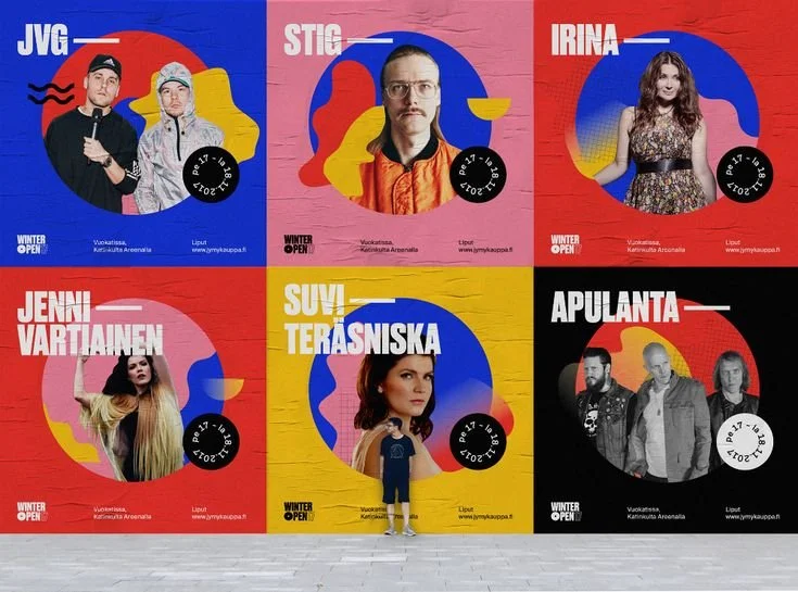
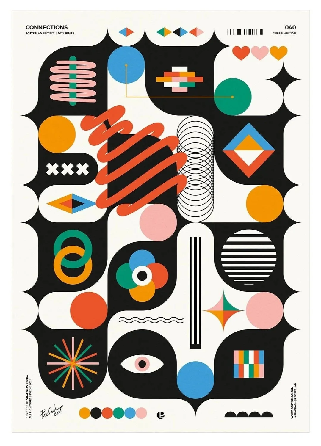
Funky, fun, colorful, exciting, with a hint of retro – all things we were chasing that the current institutional brand wasn’t delivering on.
Moodboard & Values
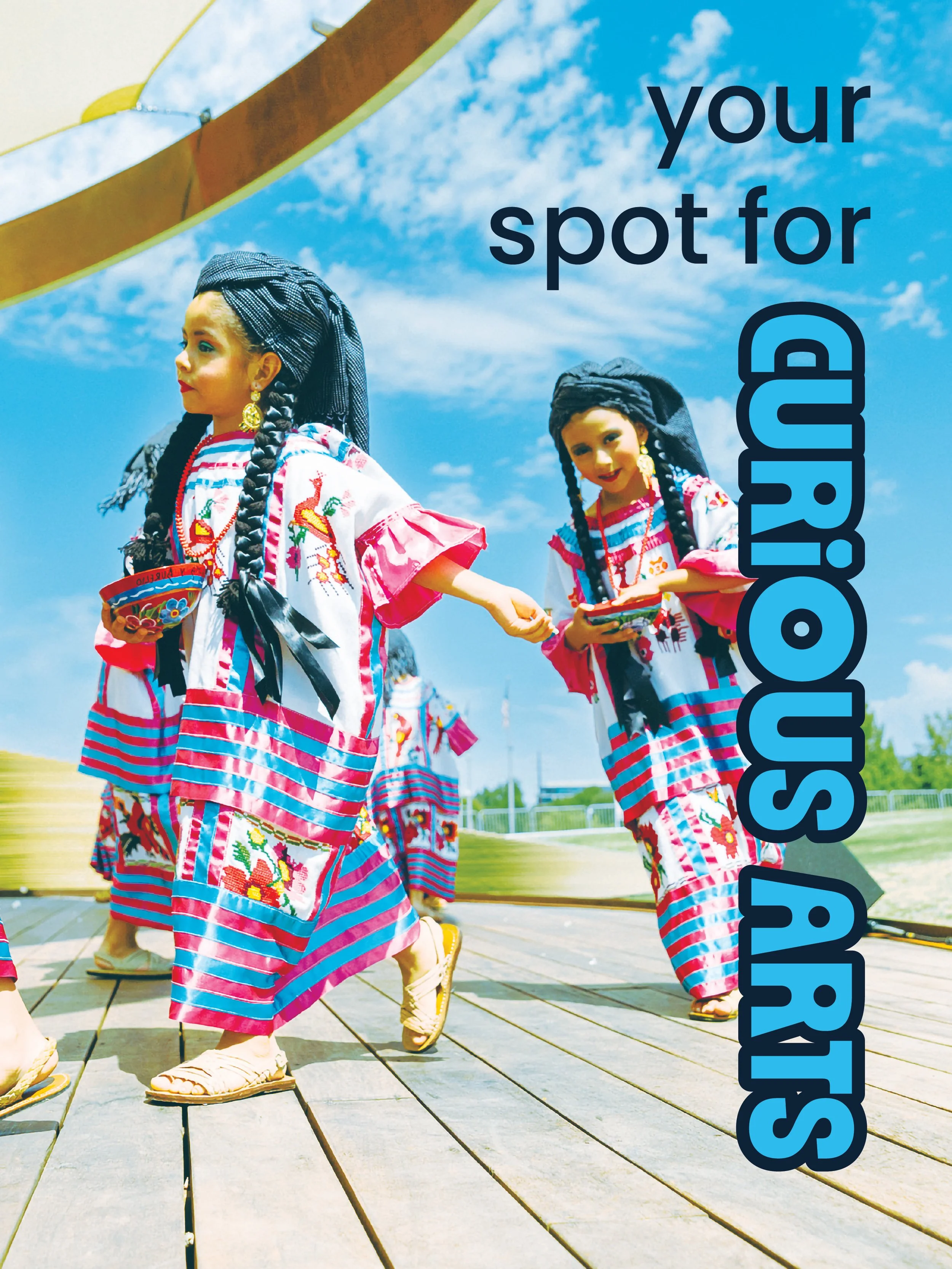
Flowing, graphical design elements, vibrant colors, and shapes that could accommodate bold photography were all key components to realign the brand.