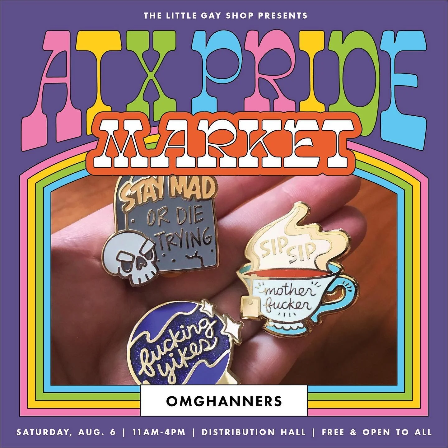
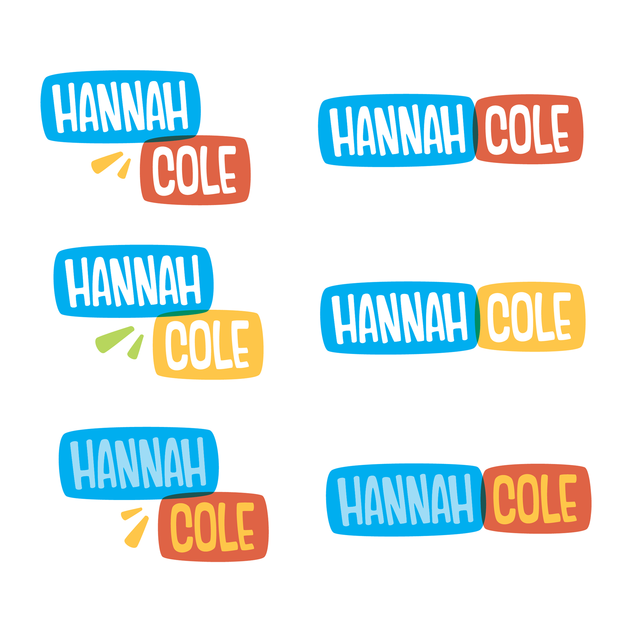
Self Branding
Hand lettered logo and collateral with equal voice in both my professional and personal creative identity
Project Duties:
Art Direction & Design
Marketing Materials (digital + print)
Sales Collateral
Vendor Management
Vision
Etc
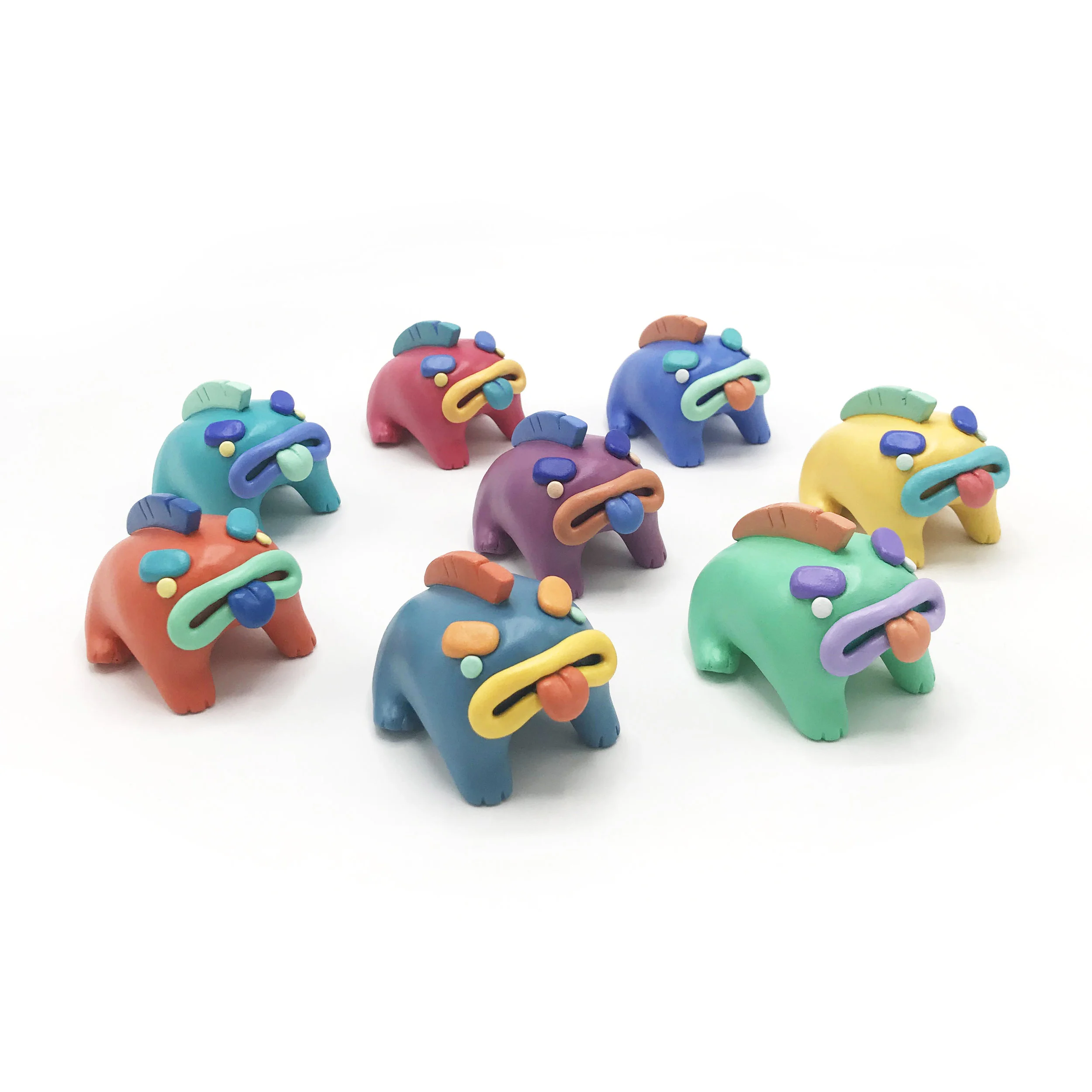
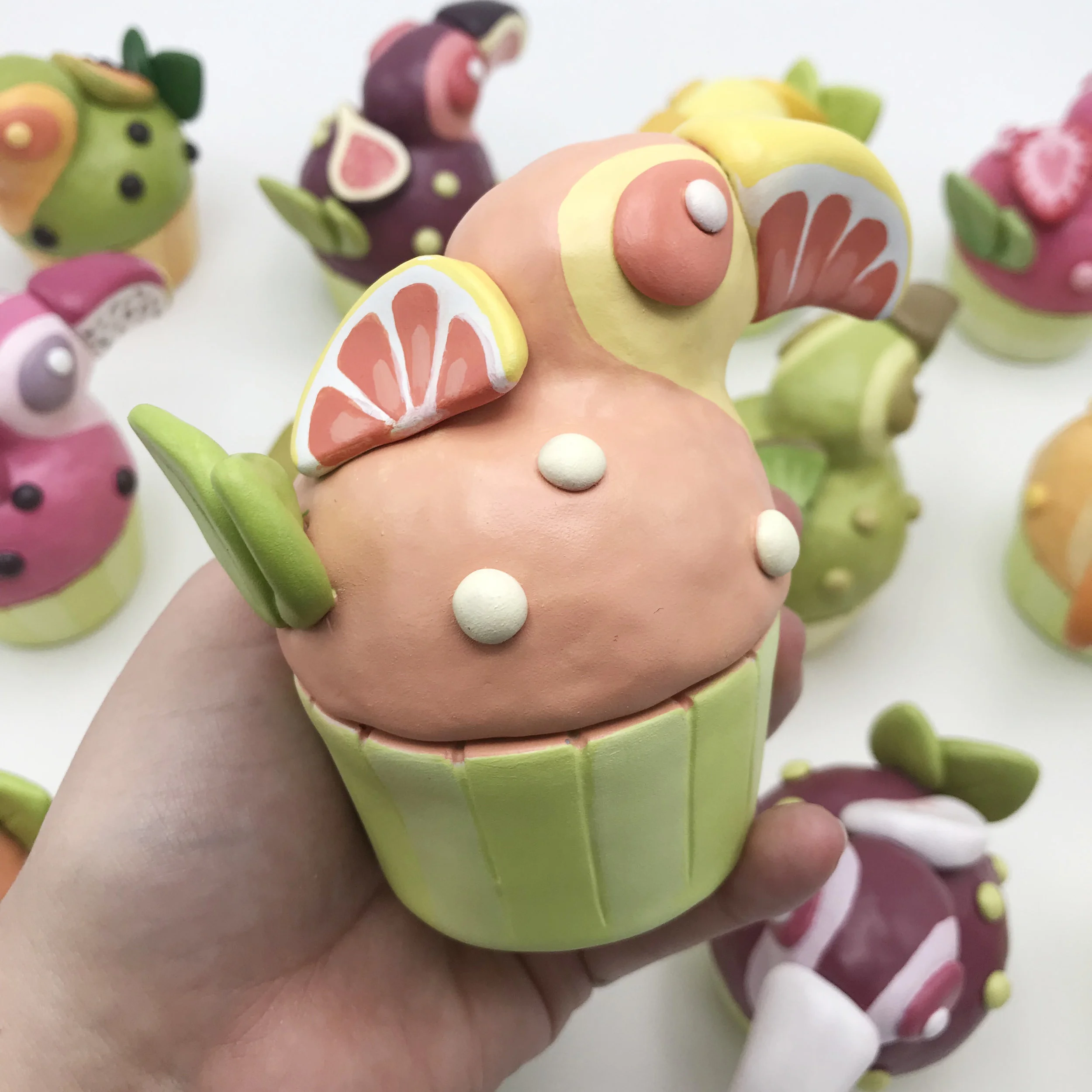
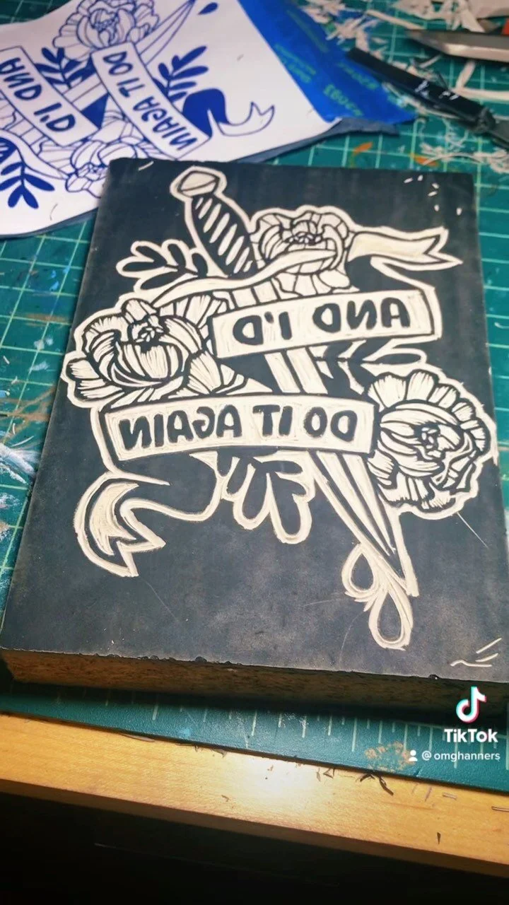
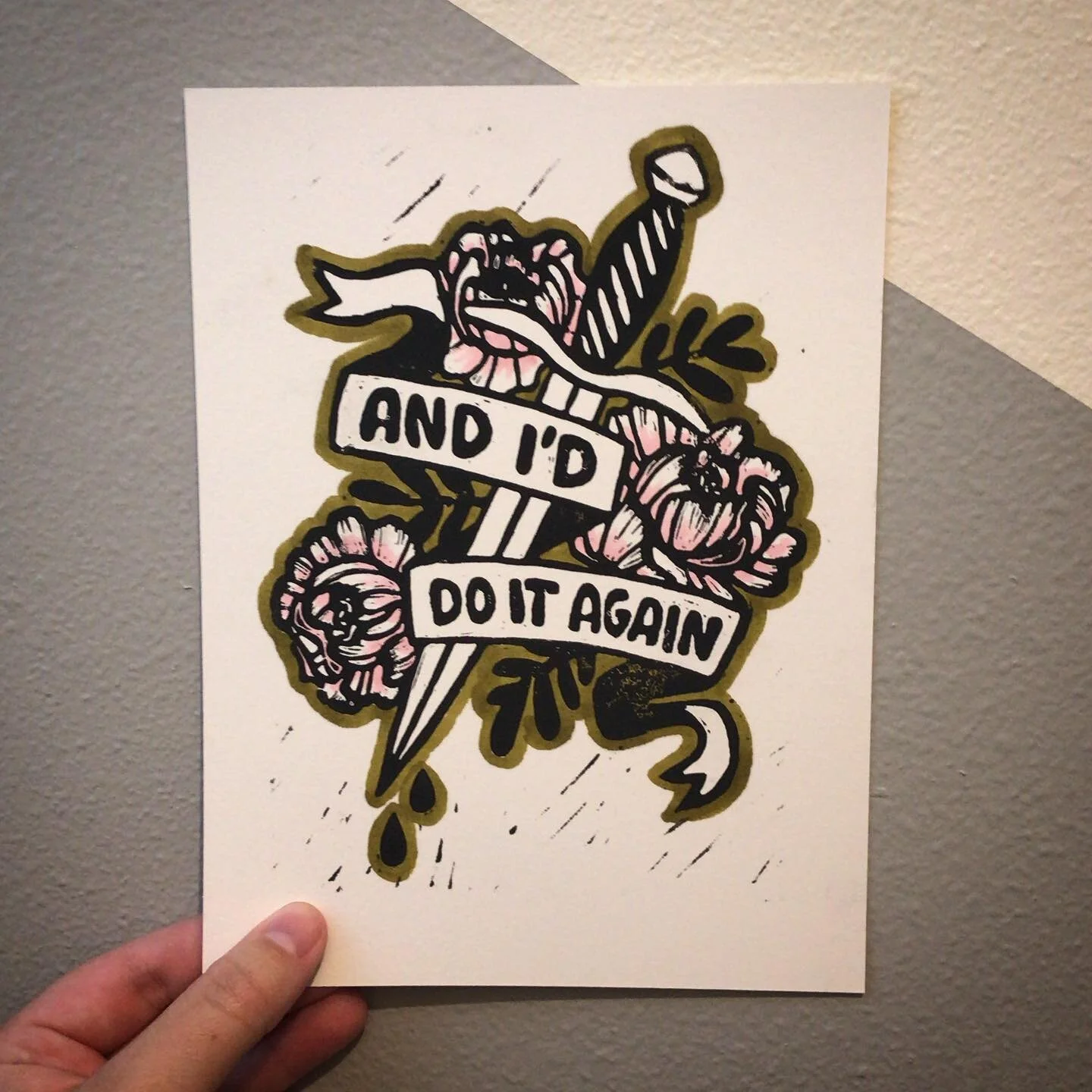
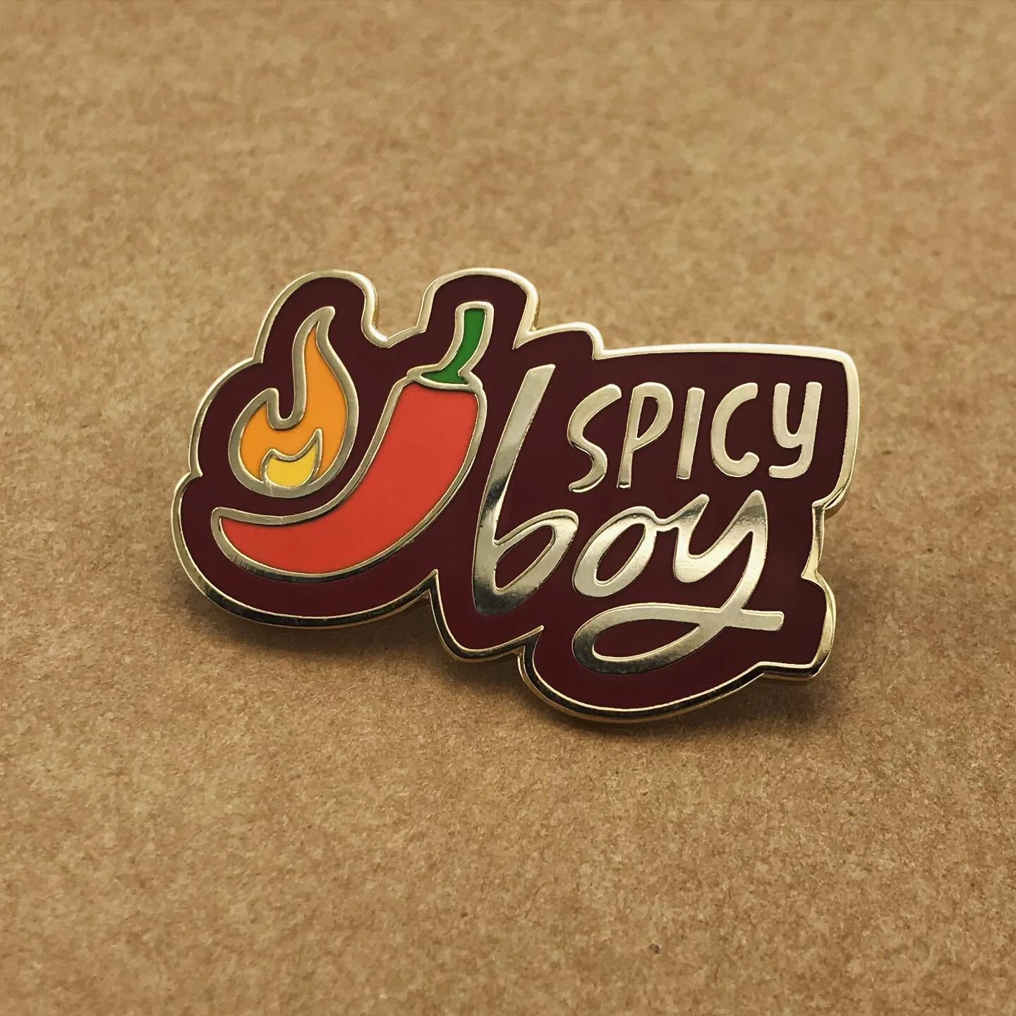
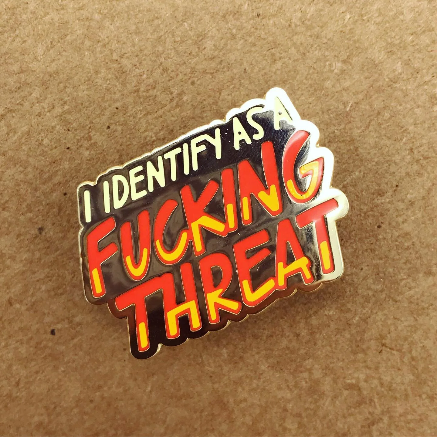
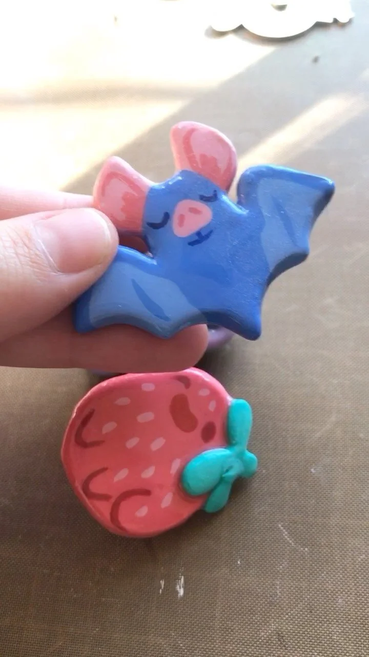
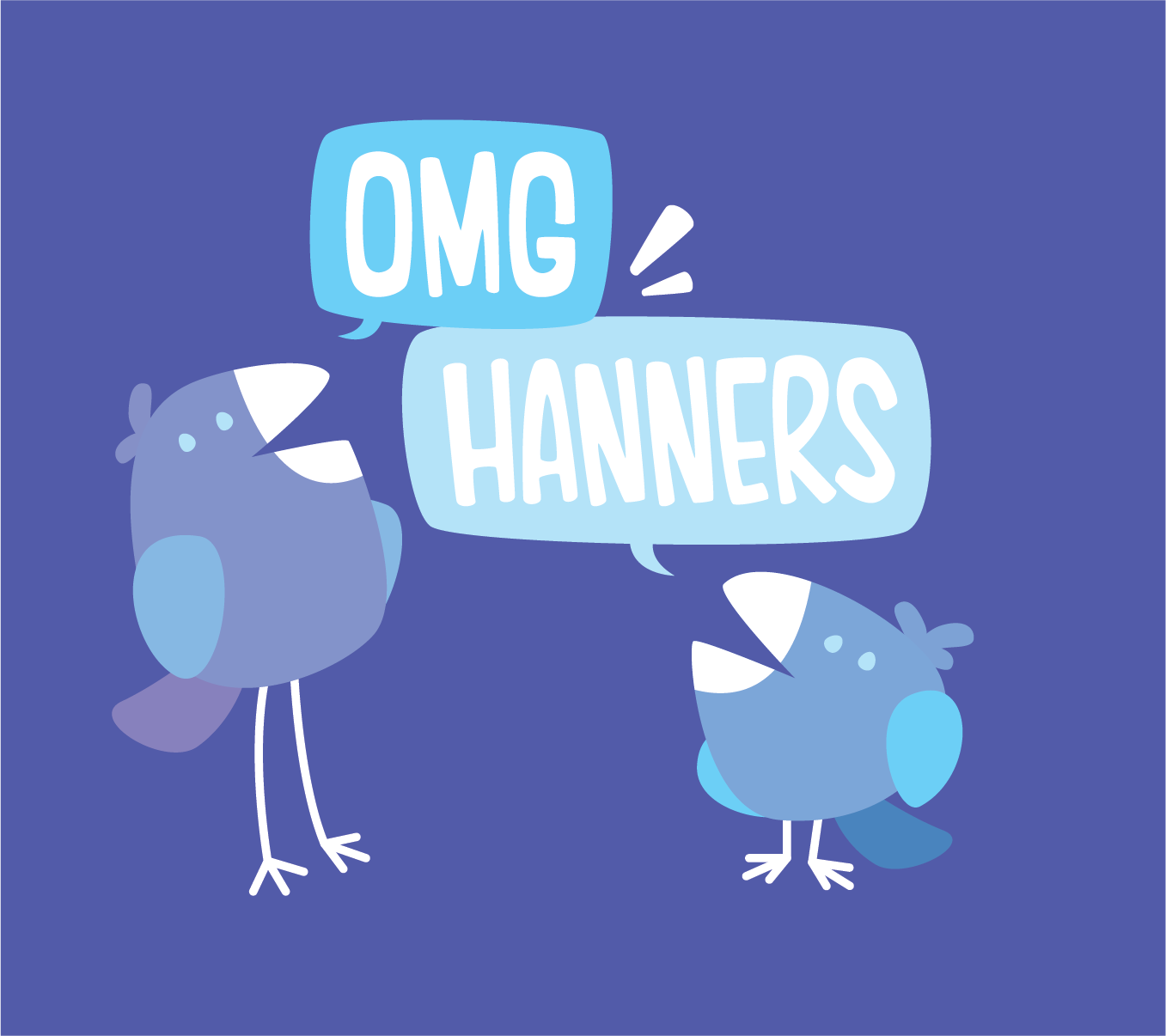
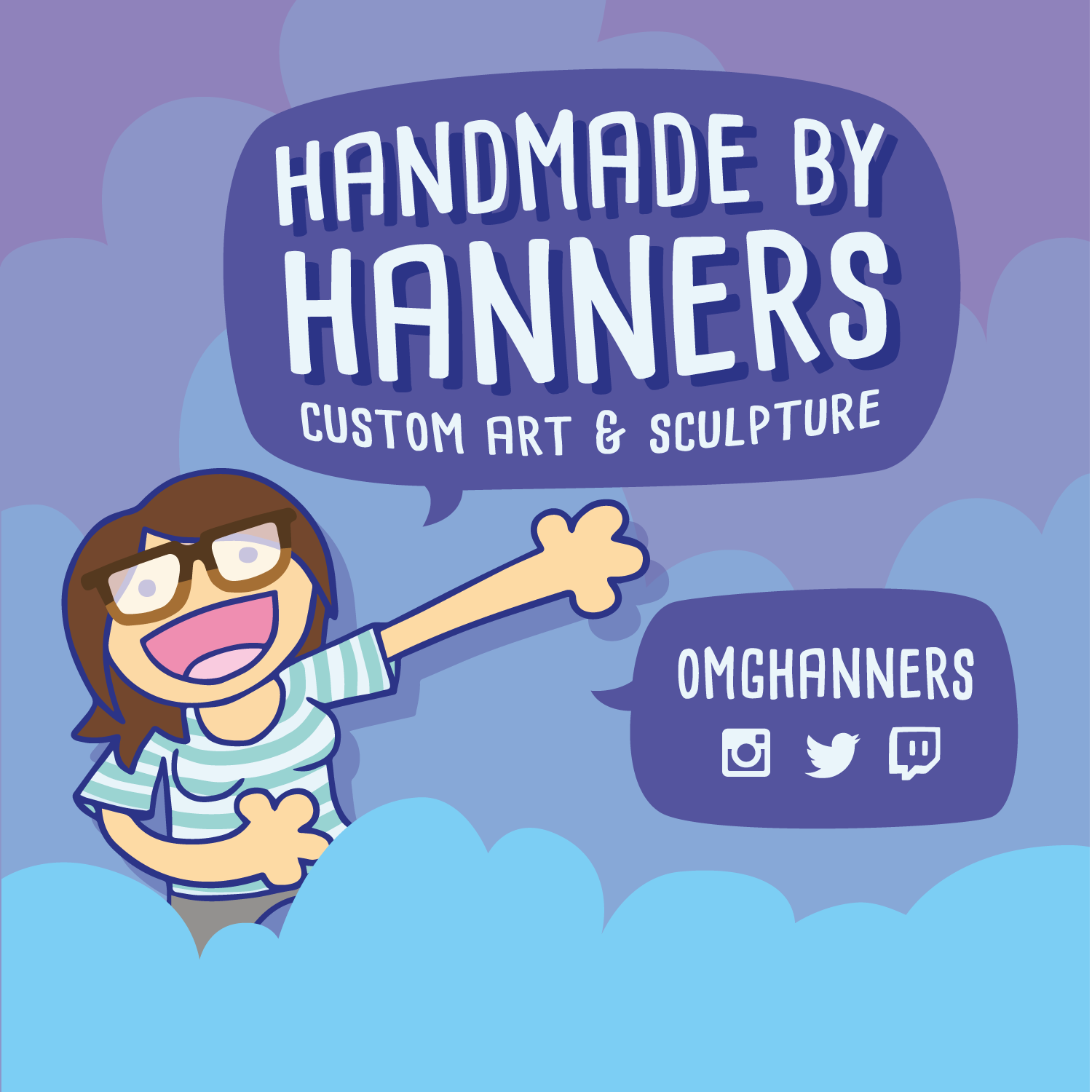
As an illustrator and designer, there was a divergence in what I considered portfolio/career work and personal creative work. A hand-lettered font coupled with bright, whimsical imagery creates a simple yet playful voice that speaks to the hand-crafted nature of my personal work, yet clean and modern that emphasizes my professional side without downplaying the spunky, kid-at-heart spirit of my brand.
Challenges
High risk, high reward
The Drop-In was a new concept and product for the Long Center launched mid-pandemic. New audience acquisition was ciritical and marketing the series required team cross-collaboration and agility within the strategy.
Outcome
Big topic that’s the overview main point blah blah
A built-to-last brand that could flexibly recombine brand colors and still allow for brand iteration and exploration. Knowing this was a reoccurring series, I wanted to create something that didn’t lose its luster after one series but distinct enough for immediate recognition. It was also critical to create not just a brand look but an emblem that translated will to single-color uses as a bug on PR and marketing materials. The archway was key in these transformations – from its retro illustration roots into a portal in photo treatments and echoing wave form in the emblem.
Brand

Collateral


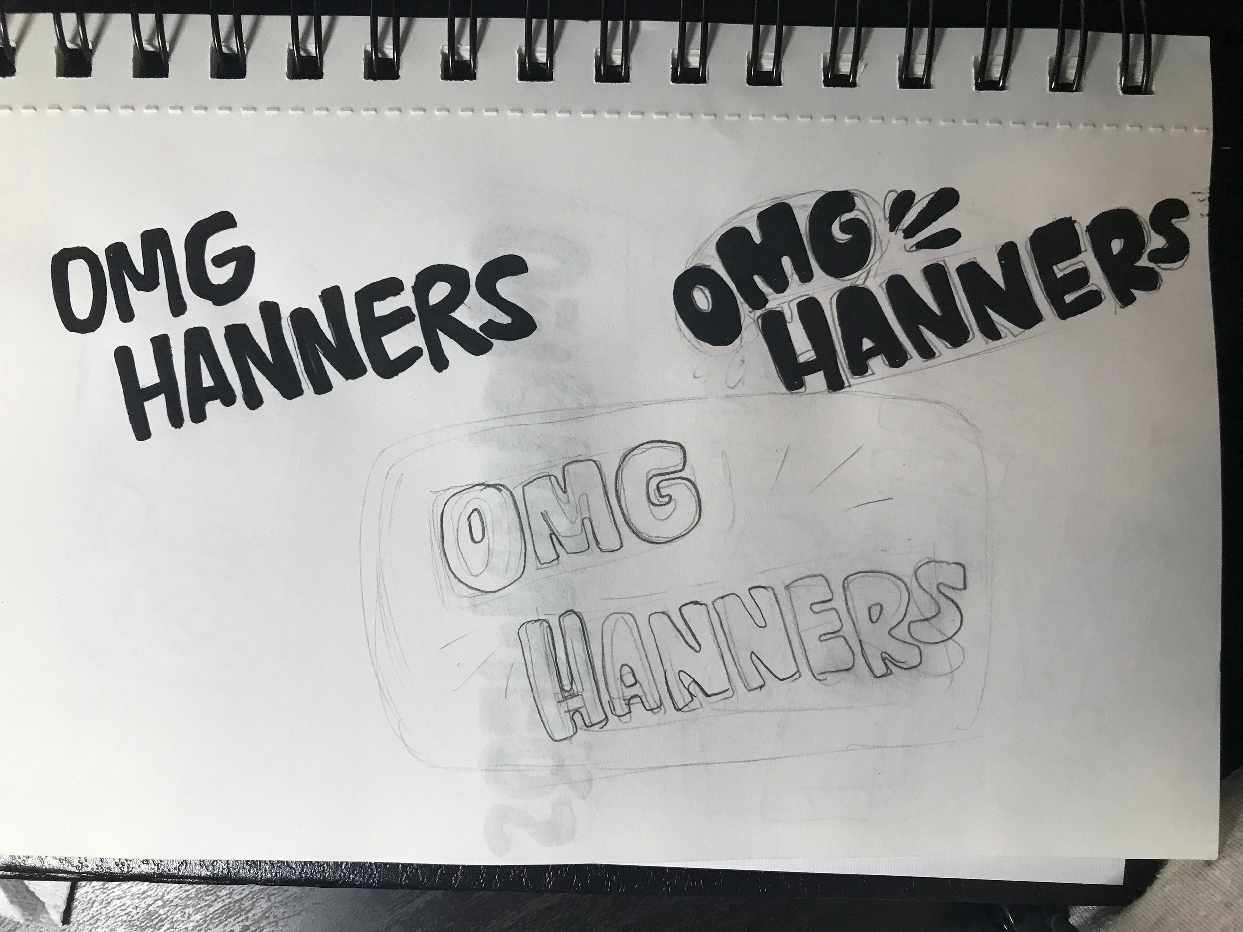
Sketchbook

2018
WIP 2018
WIP 2018
pre-2017